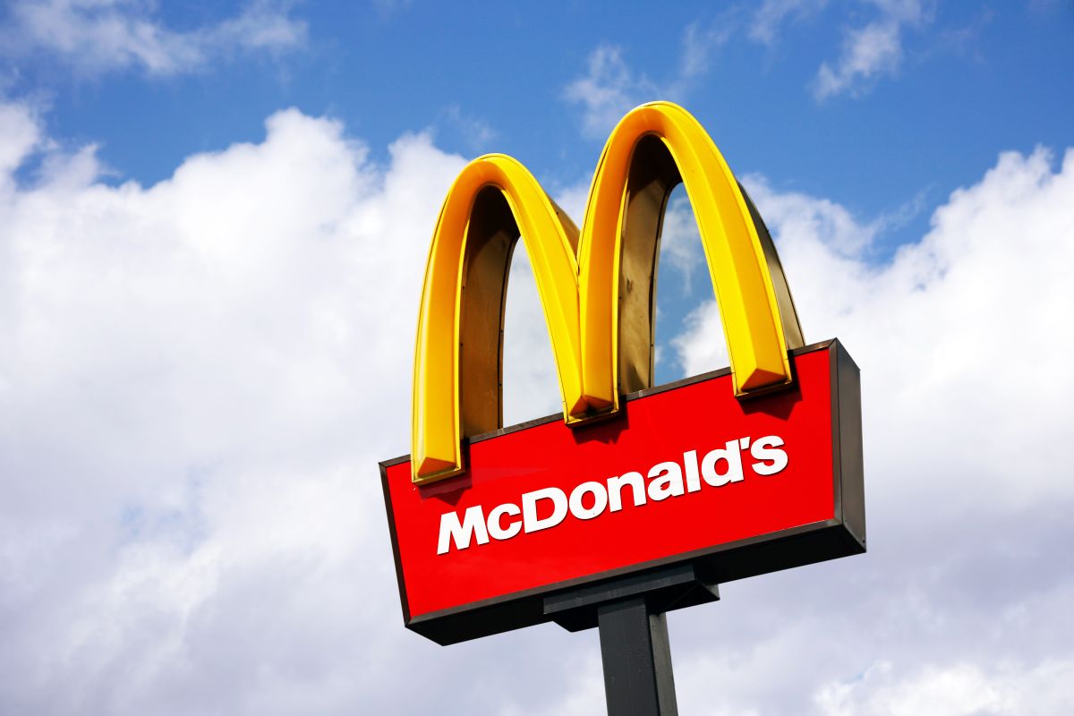
McDonald’s has used its famous red and yellow colors since its inception in the mid-1950s. However, the use of these colors is not random, since they are intended to influence your behavior.
According to psychologist Karen Haller, who is an expert on the meaning of colors, she says that the combination McDonald’s uses in its logo has a big impact on customers, which ‘makes’ the company more money.
“Red causes stimulation, appetite, hunger; Attracts attention. Yellow triggers feelings of happiness and friendship. When you combine red and yellow, you have speed, quickness. Go in, eat and go out again,” Haller said, according to The Sun US
In other words, what McDonald’s wants is for you to come in, eat quickly and leave. The logic of this is that it is convenient for the company that you do not stay long, because that way they can serve more diners
Haller also explained that yellow is the most noticeable color in daylight, which “helps” any McDonald’s restaurant stand out from the logos of other businesses on the same street.
“The language of color communicates faster to the brain than words or shapes, as they work directly on our feelings and emotions,” Haller said.
So, if the next time you look at a McDonald’s you get hungry and have an urge to eat a Big Mac, it is likely that the colors are causing that effect on you.
Keep reading:
· The enigmatic detail in the Wendy’s logo that few have noticed in almost half a century
· TikToker reveals the “secret” of McDonald’s so that its fries taste different from the others
McDonald’s is improving its iconic hamburgers
